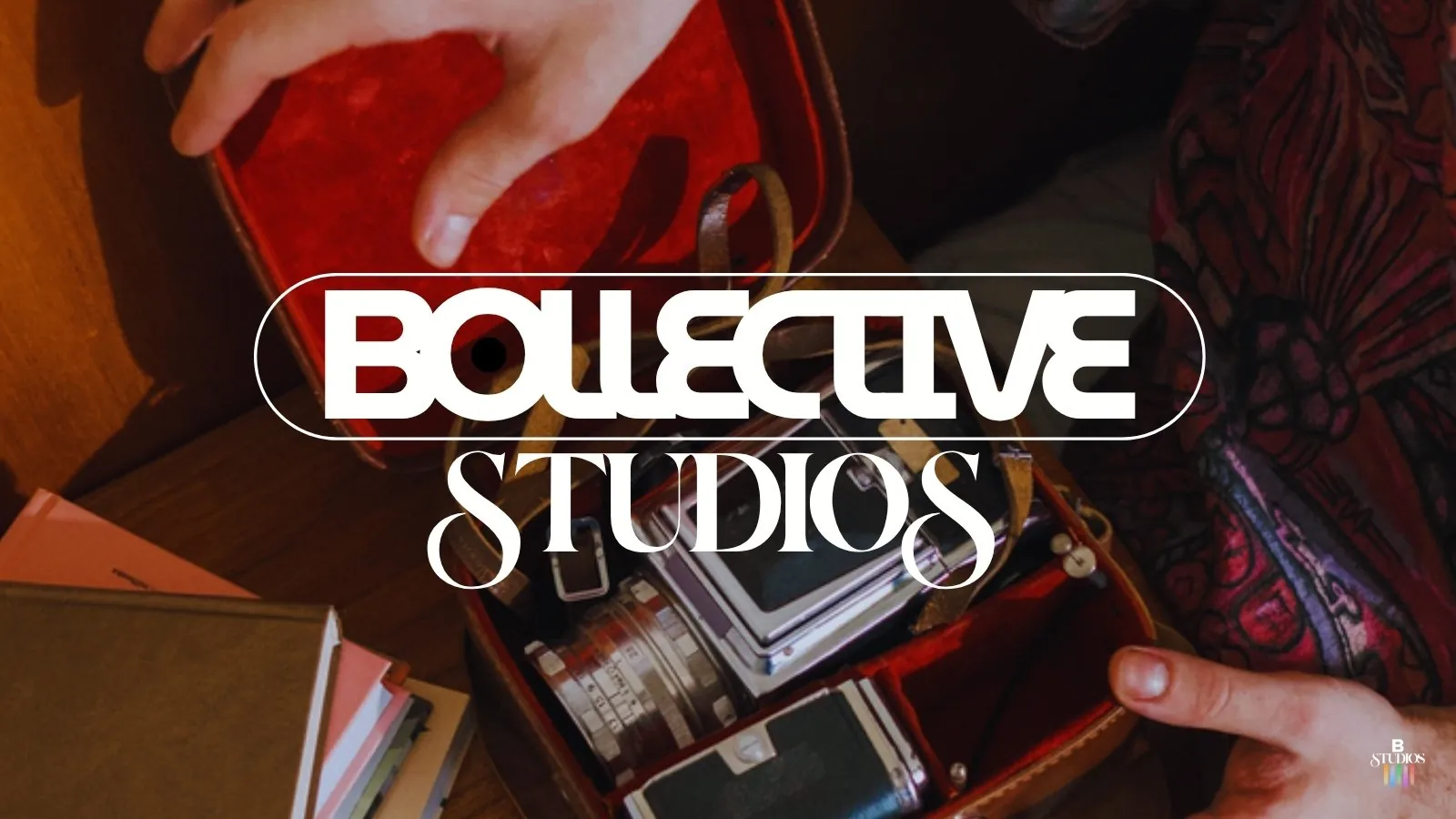

Bollective Studios identity
Colour bars, VHS and negative space: an identity that connects the past and present of the screen.
Bollective Studios is a production company born out of the desire to tell stories, a space where creative minds come together to make something unique. The colour reference comes from the colour bars used to calibrate early colour TV, redrawn in a more relaxed, modern way and balanced with black and light beige for sophistication.
The VHS era shaped the rest. Negative space inspired by cassette tapes creates the feeling of a portal or screen for every audiovisual possibility, connecting past and present on a blank canvas. The system covers the primary logo, the B Studios alternate mark, social templates and applications across music video and campaign artwork.
What I delivered
- Primary logo and B Studios alternate mark
- Colour palette from TV colour bars
- VHS-inspired concept
- Social media templates
- Campaign and music video applications
- Industry
- Production company
- Year
- 2025
- Scope
- Rebrand